The colour of the font shows that their target audience is
teen aged girls due to the choice of colour, pink. We know also that the target
audience is teenagers because the use of colour is quite childish
rather than
the use of black and white which is more sophisticated.
 The word Mean is bolder than Girl, this is done to emphasise what the film is
about. Even though the colour comes across as immature the actual font is very simplistic
which makes it look more relevant to the target audience because it’s very
contemporary looking. The fade of colour from purple to pink also makes it look
modern due to trends in fashion.
The word Mean is bolder than Girl, this is done to emphasise what the film is
about. Even though the colour comes across as immature the actual font is very simplistic
which makes it look more relevant to the target audience because it’s very
contemporary looking. The fade of colour from purple to pink also makes it look
modern due to trends in fashion. The Harry Potter Titles look like a lightning bolts which
reflect the themes of the film, danger, magic and good
vs. evil. The use of the colour gold is bright and uplifting making it stand out.
The letter P also looks like Harry’s scar which shows that they made their font
relate to the story line. Due to the font being quiet detailed it shows that
their target audience is young because it’s not very sophisticated. Due to the
font being very unique it means that it is very recognisable which makes it
great for advertising .
The Harry Potter Titles look like a lightning bolts which
reflect the themes of the film, danger, magic and good
vs. evil. The use of the colour gold is bright and uplifting making it stand out.
The letter P also looks like Harry’s scar which shows that they made their font
relate to the story line. Due to the font being quiet detailed it shows that
their target audience is young because it’s not very sophisticated. Due to the
font being very unique it means that it is very recognisable which makes it
great for advertising .The nightmare in elm street titles uses the stereo-typical use of red which is a connotation of horror films due to blood and gore. This makes it clear to the audience that the film is a horror film. The font looks quite childish due it’s messy, bold print. The word Nightmare is much bigger and bolder to the rest of the title this helps the audience to realise what the plot of the film is. The font is on a black background which is used a lot because black connotes the unknown and mystery.
 The ring which is also a horror film has a much different
font type to a nightmare in Elm Street. The font looks like hand writing of a
young child, this is done to scare the audience because a lot of the time
haunted children are used in horror films. The use of the colour white looks
quiet ghostly due to the translucent font. Connotations of the colour white
include innocence and purity which are normal features of young children.
The ring which is also a horror film has a much different
font type to a nightmare in Elm Street. The font looks like hand writing of a
young child, this is done to scare the audience because a lot of the time
haunted children are used in horror films. The use of the colour white looks
quiet ghostly due to the translucent font. Connotations of the colour white
include innocence and purity which are normal features of young children.
Nightmare in Elm Street was made in 1984 and the ring was
made in 2002, the difference in font is due to the time period, nowadays the
use of red in a horror film is very unlikely because it’s become very cliché
making it less trendy. Also now the target audience for horror films are older
now which means fonts are going to be much more mature looking.
 The font used in this titles is very basic and plain which
tells us that their target audience is around the ages of 15+.The word love is
in red and the connotations which go with that colour is love, passion and
Christmas. And all three of these are themes of the film. It also makes the
title look a bit girlier for the target audience. The word love is also much
bolder than the rest of titles this is done so the audience know straight away
what the film is about, it also makes the whole title stand out more. The word
love is normally associated with romance films which would attract a large
audience mainly women.
The font used in this titles is very basic and plain which
tells us that their target audience is around the ages of 15+.The word love is
in red and the connotations which go with that colour is love, passion and
Christmas. And all three of these are themes of the film. It also makes the
title look a bit girlier for the target audience. The word love is also much
bolder than the rest of titles this is done so the audience know straight away
what the film is about, it also makes the whole title stand out more. The word
love is normally associated with romance films which would attract a large
audience mainly women.
The James Bond font is very famous and prominent due to it
being very distinct. Using numbers rather than words is very good because it
makes the title shorter making it easier to remember. The number 7 looks like a
gun which is a convention of action films. The use of black is very
sophisticated and makes it suitable to both genders. The word Skyfall has a
distorted look to it which shows the conventions of danger and hazards. Also
the use of capital letter makes it stand out more and important.
 The lettering is very plain however having the red lettering
inside makes it more interesting and makes it stand out more. Due to its
plainness it makes it sophisticated making it valid to all ages, this is done
by having red in the font to make it more suitable for the younger audience.
The target audience for this film isn’t so obvious by the font however it’s
more likely to be boys because girls normally go for prettier fonts with the
use of pink and purple. However from the picture behind the title we can tell
the film is more based for boys because stereo-typically boys prefer dinosaurs rather
than girls who don’t normally go for that type of thing. It also makes it clear
that the genre is adventure which isn’t very popular with the girl side of the
audience.
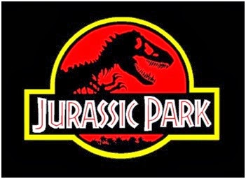
The lettering is very plain however having the red lettering
inside makes it more interesting and makes it stand out more. Due to its
plainness it makes it sophisticated making it valid to all ages, this is done
by having red in the font to make it more suitable for the younger audience.
The target audience for this film isn’t so obvious by the font however it’s
more likely to be boys because girls normally go for prettier fonts with the
use of pink and purple. However from the picture behind the title we can tell
the film is more based for boys because stereo-typically boys prefer dinosaurs rather
than girls who don’t normally go for that type of thing. It also makes it clear
that the genre is adventure which isn’t very popular with the girl side of the
audience.
No comments:
Post a Comment