For our opening two minutes, we have a rough idea of the sort of shots and editing techniques we will be using to make the two minutes of footage as successful and effective as possible.
In the scenes of our protagonist running, we plan to use:
· Tracking shot
· Medium shot
· Long shot
· Close up
· Eye-line Match
· Pull Focus
· Point of View shot
· High Angle
These are our plans for the types of shot we wish to use, however when filming this may not materialise due to practicality and the image of the shots. We believe using a tracking shot while the protagonist is running is an ideal shot for when someone is mobile. It allows the audience to follow the route and direction, and understand where the runner is aiming to end up at. This may prove difficult thought because due to previous experiences, we do find that proceeding with a tracking shot is hard to make it successful due to our low skill level, plus the speed of which the runner is running out makes it hard to smoothly follow her. A long shot is evidently easy to use, and we are planning to use it regularly, this is because it is a simple procedure, but works effectively, producing a dynamic image, including the understanding which we aim to portray for the audience. A medium shot and close up shot are both challenging shots to carry out, however we have used these shots for a snippet of the first scene, and despite them being slightly shaky, they work effectively, meeting our aims. An eye-line match may be an unusual choice of technique to use, especially when someone is on the move, however we are planning to use it when our protagonist comes to a halt and starts measuring her pulse, we believe this will add to the tension because it gives the audience a false scare that someone may be in the woods. Pull focus is tricky to use when our camera is not a specialised hi-tech piece of equipment. However we are willing to attempt to follow through with it successfully from behind a few branches, originally concentrating on the branches and then pulling the focus to a shallow focus.
The shots we aren’t planning on using:
· Extreme close up
· Low angle
· Birds – eye view shot
· Two shot
The reasoning for not using these shots is apparent, especially for the type of action which is going to be taken place. For a girl running in the woods, a two-shot is not applicable due to their only being one character present. A birds-eye view shot is not available for our whole opening two minutes due to the cost and the availability. The low angle shot will hopefully be used later on in the film, however for our runner we want to portray her vulnerability through a high-angle shot, not a low-angle shot which would make her look powerful. An extreme-close up is an incredibly challenging shot to convey because the steadiness of the camera will not be of a decent level, and the constant movement of our protagonist would mean that the framing of the shot would not work.
Thursday, 26 December 2013
Friday, 20 December 2013
Research and Planning Provisional Mark
You need to revisit research posts and explore further target audience, editing, mise en scene, locations, camera compostition, sound, light, use of titles, genre indicators, key moments. Create an animatic using your storyboard materials and comments on its strengths - this is key. You need to evidence your music research and choices. Post on the history of your genre. Make sure you haven't posted something without commenting on it fully. Evidence your timetabling. 17/20
Font ideas analysis


Titles and font types are incredibly important for an opening two minutes of a film, they help convey the correct image for the genre and they should fit in with the codes and conventions of the genre. Having 3 sub-genres for our opening two minutes, it has been difficult to decide on a suitable font which will express the accurate emotions which we believe the audience should be feeling. Having observed and analysed titles and fonts of other films similar to our genres, it has become clear that having white font on a black background will be appropriate for our opening two minutes. However that it is only for the title, we also need to take into consideration about the text which will appear over the picture when playing, such as, the producers and the actors, which should smoothly enter and exit.
The three images of fonts above are just trial fonts which we have put together so we can try and visualise what it will look like. The font at the top is called VTK DESGASTE, we were attracted to this font because it is incredibly bold and eye capturing, it is also a fairly simplistic font which is useful because it wouldn’t be too overbearing for the audience while viewing. However, even though we agreed it is a simplistic font, it is not too boring or subdued because of the destructive pattern at the bottom of each letter. This helps add the mystical yet adventurous edge to it, without being a plain bold font. However we need to take into consideration whether this font will be suitable to use for the minor information as well as the title because we need to keep the continuity going. We believe that despite this font being suitable for the title, we do not think it will be appropriate for the other information being portrayed because the lettering will be too thick and bold which may mean that it will not be readable for the audience. However the VTK DESGASTE font is definitely an option for our title.
The second font below is called Google Spies, which is very similar to the VTK DESGASTE font because it follows the same ideology of the boldness and thickness of the lettering. We prefer this lettering much more due to the distressed slash marks across the different letters, produced in a disorderly way which is synchronised with our antagonist behaviour. Even though this may not be an obvious interpretation for the audience, we still believe it is an important yet clever pattern to take into consideration. The shaping of the letters are far more curved which could be seen as more feminine, however this is only compared to the first font. The spikes poking our of the letters contrast with the curviness of the lettering and it fits in well with the crime feature of pain and death through the rough edges. The font looks far more rough and messy compared to a neat, thoughtful font, this sort of pattern and shape is what we are looking for and would be ideal for our title font. However, the same sort of problem with this font as with the VTK DESGASTE is that it will not look right with the other information we aim to produce over the top of the film.
The final font is called Piston Pressure which is simply just plain and bold, this could be seen as an advantage because it would be noticeable wherever used, however there are not interesting components which will make it an attractive font to look at. We decided not to use this font however it is useful to observe and analyse the pros and cons about it so it helps us outweigh any decisions. Due to the font being incredibly crude, it makes it difficult for the audience to guess at what genre our film would be without viewing the opening two minutes.
Having looked at these three different fonts, it has helped us become aware of the importance of continuity for our film, the first two fonts are ideal and would help capture the criminalist theme we aim to portray, however the negatives are that we can not use it for the other information which comes at a downfall.
Prop Research

 We have also chosen to feature a black brief case as part of the costume for our main investigator. We chose this because we want to make the investigator look sophisticated and make it clear to the audience that he is an authoritative figure that is respected and in control of the situation. It conforms to the stereotypes of the types of genres we are focusing on, especially crime as it sets the investigators apart from the general public/rest of the public, almost making the investigating team look a different class or above the rest, making them look superior. From our research, we have found this helps the audience trust the investigators, which makes the film more interesting as it evokes emotion from the audience.
  To add to the premeditated, planned theme we are hoping to present in the opening scene, we are going to feature a read pen in which the antagonist will circle around a girl's face in a newspaper. We wanted to include this as it will catch the audience's attention, and produce enigmas as the plot unravels. It will add to the negative theme that surrounds the antagonist as it will make the audience feel slightly unnerved and uncomfortable, suggesting he is up to something suspicious. We think this follows the conventions of abduction films as it implies the antagonist is well practised and has taken part in unlawful activities before, causing the audience to form a disliking to him.
Our protagonist will be listening to an iPod through classic white apple headphones. We have chosen to feature these as it introduces the audience to the characters background, suggesting she is of the middle/upper class. It is also a common appliance making it easier for the audience to relate to the character, which would then contribute to making the film more interesting and helping to gage the audience's attention. We also aim to make the protagonist look like a stereotypical teenager, and so we think featuring the music and headphones will aid this as it is very typical for teenagers to be engaged in their own world and oblivious to their surroundings. We think this will help to make the film more dramatic and build tension as the protagonist will appear more vulnerable and at risk.
 We hope to feature a car parked on gravel in our opening scene. We will portray the car through a low angle shot, meaning only the bottom and wheels will be seen. We have chosen to feature the car in this way as it adds to the tension and themes of our opening scene, keeping identities hidden. We also want to focus the audience's attention more on the sound of the antagonist walking over the gravel and his footsteps. Again, the antagonist will be featured through a low angle shot in order to create enigmas and keep his identity hidden, with the car being secondary in the shot.
  We have chosen to use a pin board in our opening scene, which we aim to feature in the detective scenes. We have chosen to use this type of board as it conforms to the stereotypes of crime/detective genres and so we hope it will make our film seen more realistic and professional. Using this board will introduce the detective characters and their surroundings to the audience, and we hope it will emphasise the importance of the case. On this board will be pictures of other teenage girls which will have also been involved in cases of abductions, adding to the tension and suspense of the film as it will highlight the seriousness of the situation.
Equipment
 Fujifilm FinePix HS10
Adobe Premiere Elements
Adobe Premiere Elements is a video editing software application for nonlinear video editing, published by Adobe Systems. It is a scaled-down version of the professional-level Adobe Premiere Pro, and is tailored to new editors. The entry screen offers clip organization, editing and auto-movie generation options. Premiere Pro project files are not compatible with Premiere Pro projects.
 The main use of
it for our group is the cutting and the split clip devices however we haven’t
The main use of
it for our group is the cutting and the split clip devices however we haven’t
ventured through the other facilities because of the genre we have chosen, thriller doesn’t use many effect because their normally supposed to be realistic and the use of effects normally make a film less realistic. Many of the transitions available aren’t suitable for movies because they are too extravagant this also takes the realism away from the film. The cutting tool is used to crop clips to the length you desire , the split clip tool basically does what it says on the tin , it splits your clips so you can use parts of one video at different parts throughout the film ,these tools have been used at all times throughout the editing stage.
 Tri-pod
A tri-pod is used to hold a camera in place, the camera is fastened on to the top and able to move using a lever. The tri-pod can stand up to about 1.5 meters high which is brilliant because it means it works at the perfect height. The lever is used to move the camera from side to side and up and down, this enables us to do all the different shot types we desire from high angle to low angle. The different heights means we are able to different shot types too. However the lever has been quite stiff which means we haven’t been able to move the camera very swiftly causing the camera to jolt and get stuck. This has meant we have had to do the same shot more often than we expected because it didn’t look how we wanted it.
Soundtrack/Effects Research
A sound track is a piece of music used in films and
television to tell a story or to add emphasis, this leads to it being repeated
throughout the film. A sound track can also include songs for musicals such as
Mamma Mia. On many occasions the soundtrack becomes very popular and end up selling
millions of records all over the world, this is great advertisement from the
film and a brilliant way of people remembering a film. An example of this is “My
heart will go on” which is in the 2nd most grossing film of all
time, Titanic. This gives us a lot of pressure because this means our
soundtrack has to be good enough to be memorable.
We have decided to find some non-copy right music off YouTube as there is such a variety of choices online. This means we have less control of the music however we can edit it on the software we have been given so it fits in with each scene.
One of our main inspirations for our whole opening two minutes is Luther the TV series; it’s in the same genre as ours and has a similar storyline too. The soundtrack they use is called “Paradise Circus” which stars throughout the series while the credits are up. We decided earlier on in our research stages that we didn’t want lyrics however this soundtrack does, apart from this we enjoyed how it worked with the show. There is a lot going on through the track including what sounds like clapping, a piano, bass and maybe a xylophone. Overall it’s quite soft and seductive but also dark at the same time with the high notes. The bass in the background adds to the city feel as it’s based in London but the soft seductive side is similar to his personality.
We have also been thinking about using the sound of a heart beat at some point throughout our opening two minutes, we think this is a good way of the audience being able to interact with the character as it comes across as very personal and helps put the audience into their perspective.
We have decided to find some non-copy right music off YouTube as there is such a variety of choices online. This means we have less control of the music however we can edit it on the software we have been given so it fits in with each scene.
One of our main inspirations for our whole opening two minutes is Luther the TV series; it’s in the same genre as ours and has a similar storyline too. The soundtrack they use is called “Paradise Circus” which stars throughout the series while the credits are up. We decided earlier on in our research stages that we didn’t want lyrics however this soundtrack does, apart from this we enjoyed how it worked with the show. There is a lot going on through the track including what sounds like clapping, a piano, bass and maybe a xylophone. Overall it’s quite soft and seductive but also dark at the same time with the high notes. The bass in the background adds to the city feel as it’s based in London but the soft seductive side is similar to his personality.
The Taken 2 soundtrack called “Tick of the Clock “is very
effective due to its simplicity, the sound of a clock adds enigma’s and gives
the idea that time matters. The sound fades in and out and gets faster which
gives the audience the impression something is going to happen. After over 1
minute the music change and goes very low pitched then fades into a high
pitched tune which becomes deafening gives the effect of danger. It then
replays the beginning of the soundtrack, the contrast in music means it works
well in a variety of scenes.
After deliberation we decided to go for an orchestral based music as we thought it was a brilliant
choice of music to add suspense and mystery, it been used regularly in TV
thriller series such as Luther which has a very similar feel to ours. The
benefit of using orchestral music is that the tone and pace changes throughout
the music this means it can fit into different scenes and still works well, it
also adds more dimension to the clip. We also liked the effect a ticking clock
had and may add it behind the orchestral based music; we thought it was a great
way of making the soundtrack more trendy and up-to-date.We have also been thinking about using the sound of a heart beat at some point throughout our opening two minutes, we think this is a good way of the audience being able to interact with the character as it comes across as very personal and helps put the audience into their perspective.
We looked at other types of music that were a bit more
upbeat however they didn’t fit into the feel of the story it may of confused
the audience, , we also wanted it to be realistic to the genre.
Friday, 13 December 2013
Mood Board

This is our mood board which gives everyone a vague idea about what our film connotes, displaying the different aspects of each scene, character and location. The pictures aren't precise with our ideas for the opening two minutes; however we will be using similar characters and props. I have numbered the different pictures to help signify what photos I will be discussing and my reasoning for choosing them.
The first image has been placed on my mood board because it fits in with the horror/thriller theme, which is what our film is hopefully going to be portraying. The house looks damaged and old, despite the size, its not something you can picture a traditional family living in, which is why I have chosen it. It is mangled and falling down, but the size is perfect for what we want the antagonist to represent. It fits in with the stereotypes of a typical location for a thriller film with the enormous acres of land, but little decency within the building. It represents a male who has his minds on other things, which in our case, would be the girl he is looking to take, the distractions the male is going to represent is shown through the lack of care and delicacy taken on the house. The house doesn't feature any contemporary structures which fit in with the thriller codes and conventions because the history of the building is important to the basic ideology.
Image 2 represents the crime features of our film. This is a stereotypical image which is featured in a lot of crime related programmes and films. It enables the audience to view the complexity and the detail within the crime which is being presented with all the images. In our film we will use an over the shoulder shot, like what is displayed in the image. The pictures on the board will represent the girls the antagonist has taken, subtly hinting to the audience that the antagonist is not taking our protagonist spontaneously.
Image 3 represents the main action which takes place throughout the opening two minutes; we will have numerous shots, varying from tracking shot to long shots, of our protagonist running cutting between the different scenes. The continuity of the constant cuts will help increase the tension. Image 4 is a similar image to image 3 which helps highlight the importance of the running shots because it is what keeps the opening scene together, separating it from the fantasy aspect of a crime film, linking to reality.
Image 5 helps codify our genre of a crime film because it displays the policing side of an investigation, which recognises the obvious, which is that the antagonist commits the crime. The office sets aside a separate location which helps devise the opening two minutes in to separate places which initiates the different scenes.
Image 6 indicates the style of house we are using to locate an establishing shot in. It is a large, American-style house which represents wealth and purity with the cream painting. Having such a big house helps fit in with the stereotypes of a criminal’s behaviour.
Image 7 gives the viewers a brief idea of what sort of costumes will be involved, it is aimed at the antagonist as the large black boots represents the stereotypical idea of a disturbed farmer seeking for popularity and appearance. The low angle shot is a good indication in to what sort of shot we will be using in our opening scene, keeping the identity liminal.
Image 8 is a pivotal image which sums up the whole film, instantly, by taking a glance at the males face you can tell this sort of man is likely to be mentally challenged and very stereotypically paedophile, this is due to the stereotypes of which the society creates through their everyday life. The smirk distracts the audience from his criminal side and the clothing subverts to the stereotypes, side-tracking the audience in to thinking he is not the antagonist of the movie.
Image 9 displays another location of which the majority of the film will be shot in, the green area with the large trees drooping over a single pathway fits in with our creepy manor of our film. The same with image 10, which only slightly differs from image 9 because it is an open planned area, they are both locations which would be used when our protagonist is running. However the reasoning for how the differs is due to the open and closed planned areas and how they portray different emotions. The open planned area suggests freedom and how the protagonist is most likely to be safer because it has a larger surface area for more people to commute to. The closed area makes the protagonist more vulnerable because it is so secretive and discrete.
Wednesday, 4 December 2013
Saturday, 30 November 2013
Shot List

These our original shot list ideas however throughtout our filming process these have changed due to trying alot more ideas just so we could make sure we had the shot. This meant that our originial ideas havn't been used however at the end of filming we will evaluate why we chose these shot and not the others.However we have chose a variety of diferent shots which add different effects to the film.
The reason we chose to set out our screeen shot ideas in excel was because we found it easy to work with and much neater than any other way.
Friday, 22 November 2013
Planning Targets
Well done. Very organised. You need to upload a storyboard and an animatic and comment on your choices. Video-diaries of the filming process (edit some montages to rteally impress) will make your research and planning really special. I would like to see a schedule of events and key dates. A very organised blog - keep going!
Audience profiling

 The movie we’re planning to film is a Crime/Action/Thriller;
we made some research and found a couple of films which are in the same genre
of ours then found out their audience types. Inception has a sense of thriller
in the film and there most popular audience age is 15-24.Taken 2 which is also
very similar to our film is an action/thriller and again their most popular
audience is 15-24.This suggests that our target audience should be the same as theirs
due to plots being similar.
The movie we’re planning to film is a Crime/Action/Thriller;
we made some research and found a couple of films which are in the same genre
of ours then found out their audience types. Inception has a sense of thriller
in the film and there most popular audience age is 15-24.Taken 2 which is also
very similar to our film is an action/thriller and again their most popular
audience is 15-24.This suggests that our target audience should be the same as theirs
due to plots being similar. 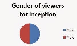
 From other research we have established that boys enjoy
these genres more than girls however they were surprisingly incredibly close with
50%-50% for inceptions with the ratio of boys to girls and 54%-46% for Taken 2 this
suggests that both of these films have used the perfect amount of crime, action
and thriller to keep both audiences content. However other variables such as
the use of very famous actors and good looking men will help the Female
audience to increase. The use of female character in an action or thriller makes wil help the female audience to increase because they may be able to relate to the character.It especially helps when the women character subverts the stereo-type of women being Damsel-in-distress and becomes the hero.
From other research we have established that boys enjoy
these genres more than girls however they were surprisingly incredibly close with
50%-50% for inceptions with the ratio of boys to girls and 54%-46% for Taken 2 this
suggests that both of these films have used the perfect amount of crime, action
and thriller to keep both audiences content. However other variables such as
the use of very famous actors and good looking men will help the Female
audience to increase. The use of female character in an action or thriller makes wil help the female audience to increase because they may be able to relate to the character.It especially helps when the women character subverts the stereo-type of women being Damsel-in-distress and becomes the hero.
 The last thing that effects the type of audience is
different type of class’s, from our research we found out that that the
high-middle class was the highest percentage of audience watching Inception however
in Taken 2 low to middle was the highest. This could be down to the use of
science fiction in Inception which may of been more popular with the higher
class because it’s obvious a lot of money has been put into the film ($160 million)
however Taken 2 is more realistic and the budget would of been much lower ($40
million) this may mean the lower class’s could relate more to Taken 2.
The last thing that effects the type of audience is
different type of class’s, from our research we found out that that the
high-middle class was the highest percentage of audience watching Inception however
in Taken 2 low to middle was the highest. This could be down to the use of
science fiction in Inception which may of been more popular with the higher
class because it’s obvious a lot of money has been put into the film ($160 million)
however Taken 2 is more realistic and the budget would of been much lower ($40
million) this may mean the lower class’s could relate more to Taken 2.Knowing what our target audience is going to be is very important
because we need to know what is suitable and appropriate, for example if our target audience was between the ages of 8 and 12 it wouldnt be suitable to swear because it would be out of place to the story line . However Knowing that our target audeince should be between the ages of 15 and 24 means we can be more free with what we choose , if anything the most important thing to do is to make sure its matture enough and realistic to the real danger s of society otherwise people will get bored if its too un-realistic.


Thursday, 21 November 2013
Specific Genre Font Research

As research for our film, we looked at a number of different style fonts, in the hope to give us inspiration for our own. After looking through hundreds of different types of typography, we came to the conclusion we wanted to narrow our searches to a more simplistic, classy but not unnoticeable type of font. We decided with our film having elements of the crime, action, thriller genre, it would be best to gage both information and inspiration from titles of these genres. Here are just a few examples of titles we have looked at.
From this, we have learnt that titles do not need to be overly showy or flamboyant to stand out and look effective. Although all of these titles are from our particular genres, there and some we like and some we don’t for certain reasons. The film GONE is only four letters, making it inevitable that the spacing is as large as it is for the title to fit, however in our opinion, we think the typography and spacing is better suited to the horror genre as it makes it look less sophisticated and slightly amateurish – a look we want to avoid. Although disliking the font and spacing, the colouring and effects used are quite successful and fit well with the background, helping to make the film suit the genre and look slightly mysterious. The film SIDE EFFECTS is effective as it stands out against the background and is very clear, however the font is slightly too harsh and plain for our film, but we think it works well for its particular plot. It gives the impression not a lot of thought has gone into it as it is so simple, and we want ours to look well thought out and fitting for our film.
As a group, we had different opinions on the titling for PRISONERS. Having seen the film myself, I really like the font and think it is well suited to the film, and I also think the emblem/symbol in the O is a very clever element, added to fit with the plot and to create enigmas for the audience before they have even seen the film. I think the font stands out effectively and catches your attention without being too showy, however the other two members of my group – Charlotte and Laura are not so keen. They think the font is a bit too much and slightly unnecessary. We all liked the font for WASTELAND and thought it was clever how it fitted with the background and faded out in certain areas, an effect we may experiment with for ours, however we do think it is slightly too thick. This could be beneficial as it certainly draws the audience’s attention to it, however we believe it would have too much attention and slightly take over the full image which is behind it.
As a group, we had different opinions on the titling for PRISONERS. Having seen the film myself, I really like the font and think it is well suited to the film, and I also think the emblem/symbol in the O is a very clever element, added to fit with the plot and to create enigmas for the audience before they have even seen the film. I think the font stands out effectively and catches your attention without being too showy, however the other two members of my group – Charlotte and Laura are not so keen. They think the font is a bit too much and slightly unnecessary. We all liked the font for WASTELAND and thought it was clever how it fitted with the background and faded out in certain areas, an effect we may experiment with for ours, however we do think it is slightly too thick. This could be beneficial as it certainly draws the audience’s attention to it, however we believe it would have too much attention and slightly take over the full image which is behind it.
TINKER TAILOR SOLDIER SPY was the font we all agreed we liked the most. Although it is still very plain, it is very effective and stands out against the background well, catching the audience’s attention. It gives the film a sophisticated and classy look, fitting well with both the genre and the plot, as well as attracting its target audience – the older, middle/upper class. We particularly like the way the font subtly grows in size, putting more emphasis on the last 2 words. This is certainly an effect we are going to take into consideration, however we are unsure if it would be as effectively as we haven’t yet decided on a name, and don’t know if it would be as successful with a shorter title. This title also inspired us to use more than one type of font in our title, something which we have already experimented with, and we believe it works well having different fonts and sizes in a title, as long as they are not too over the top and complement each other rather than making the film look childish and unprofessional.
INUMBER NUMBER is the first title we have come across in these genres where the lettering is in different cases. Having not seen the film and as we are unaware of the plot, we are unsure if this fits well with the film, however we all agree it gives it a more futuristic/sci-fi feel, which is something we do not want. We want our film to be as realistic and believable as possible, so from our research we have come to the conclusion that different cases are something to avoid, and think we will just stick with all upper case as lower case would make it childish and easily dismissible. Despite the different cases, we like the font style, and think the colour scheme used for the background and title has both benefits and weak points. The similar colouring used makes it slightly difficult to read as it doesn’t stand out very clearly against the background making it less eye catching, however this could be done purposely as it may fit with the genre and plot, making it more mysterious and secretive, creating enigmas for the audience. Initially, TAKEN was the film we were basing our plot around as it was such a successful film and a similar genre to ours. The titling used in TAKEN is very iconic to both the film and the action genre, which is something we are going to try and avoid as our film is not solely action so we don’t want to advertise it misleadingly. Despite not thinking the font is appropriate for us, we think it works very effectively in displaying the genre, and stands out, catching the audience’s attention which is something we aim to do.
Tuesday, 19 November 2013
Protagonist Costume
The type of costume you choose for a character is very important because it can help the audience to get to know the character, for example their class, where they live, age or even gender. The choice of costume we have picked I think represents our character and the conventions that go with her.


 Lily, the protagonist, is the first character which the audience are introduced to; this is when she is just about to go on a run. With the use of her appearance we are trying to make sure the audience realise that she is a stereo-typical victim .Stereo-typically victims in this type of film have blonde hair which has an association with being beautiful and a bit dim-witted. Not only does the colour of her hair help with the stereo-typical look but she will also be wearing a running outfit which is pink and black also with purple trainers which comes across as quite girly and may cause un-needed attention when only going on a run. This shows that the character is oblivious to the dangers around her, which in her case does become a problem when she is abducted. The costume is very uniformed and smart which also helps the audience to understand that Lily is from a higher class, which maybe the reason behind the antagonist attacking her due to his jealousy.
Lilies hair will be tied up in a slicked back, tidy pony tail this makes the audience think she cares about her appearance which is very stereo-typical for a women victim. She will also be wearing a full face of mak-eup which isn't needed when going on a run this will make Lily look vain but a lot of the time this is normal for her type of character


 Lily, the protagonist, is the first character which the audience are introduced to; this is when she is just about to go on a run. With the use of her appearance we are trying to make sure the audience realise that she is a stereo-typical victim .Stereo-typically victims in this type of film have blonde hair which has an association with being beautiful and a bit dim-witted. Not only does the colour of her hair help with the stereo-typical look but she will also be wearing a running outfit which is pink and black also with purple trainers which comes across as quite girly and may cause un-needed attention when only going on a run. This shows that the character is oblivious to the dangers around her, which in her case does become a problem when she is abducted. The costume is very uniformed and smart which also helps the audience to understand that Lily is from a higher class, which maybe the reason behind the antagonist attacking her due to his jealousy.
The trainers that Christie, our actor, is going to wear have clearly been used a lot this makes it more realistic and shows that she goes on a run regularly. The trainers we are using are from Nike, this is an expensive sports brand which also shows that she is from a higher class family where they can spend a lot of money on small thing like trainers.
Lilies hair will be tied up in a slicked back, tidy pony tail this makes the audience think she cares about her appearance which is very stereo-typical for a women victim. She will also be wearing a full face of mak-eup which isn't needed when going on a run this will make Lily look vain but a lot of the time this is normal for her type of character
Atangonist costume
Not much of the antagonist’s costume will be on display, due to the minimalistic shots of him, this is because we want to reduce the prevalence in order to create enigmas and display that he is the main antagonist to the audience. Even though he is an important character the less prevalence means the larger increase in tension.
 These are the ideal boots we would want the antagonist to wear; this is because they are big and clumpy and conform to the stereotypes of a criminal’s mise-en-scene as they suggest some sort of dangerous activity, making the audience feel slightly uncomfortable. They will also help out with the dietetic sound because they have a large surface area so the sound would be greater against the gravel and stones when walking to the car, providing a larger depth of sound, making it more effective at building suspense. They are also practical for the type of locations we will be filming at, and they fit in with the other locations which the protagonist will be filmed at, adding more realism. The clump of the boot works well with the profile of the antagonist because we want him to walk with purpose and the action of stomping on the ground will help us achieve this.
 A black beanie hat is another part of the costume because it helps keep the disguise undercover so nothing is revealed while filming as well as producing dark tones by the colour. This helps keep the tension high because the audience don’t know who or what the man looks like. The black beanie fits in with the black clothing because it also helps to create a concealing outfit. The reasoning behind our lack of costume research is due to the type of camera work we intend to use. We are planning to cover the antagonist's identity as much as possible so we do not think it is necessary to research any other types of clothing as we do not plan to show them on film, helping to creates enigmas and build suspense and tension.
 These are the ideal boots we would want the antagonist to wear; this is because they are big and clumpy and conform to the stereotypes of a criminal’s mise-en-scene as they suggest some sort of dangerous activity, making the audience feel slightly uncomfortable. They will also help out with the dietetic sound because they have a large surface area so the sound would be greater against the gravel and stones when walking to the car, providing a larger depth of sound, making it more effective at building suspense. They are also practical for the type of locations we will be filming at, and they fit in with the other locations which the protagonist will be filmed at, adding more realism. The clump of the boot works well with the profile of the antagonist because we want him to walk with purpose and the action of stomping on the ground will help us achieve this.
Fingerless gloves will be ideal to creating a criminalistic image of the antagonist because the dirty fingernails will be shown which helps fit in with what he is about to do in the woods, it also portrays a dirty and careless attitude of a working class male which is one of the stereotypes which revolve around villains. The fingerless gloves fit in with the poor representation because stereotypically they are associated with homeless people, so it proceeds with an effective image. The fingers will be shown through close up shots, which is why the nails have to be dirty.
 A black beanie hat is another part of the costume because it helps keep the disguise undercover so nothing is revealed while filming as well as producing dark tones by the colour. This helps keep the tension high because the audience don’t know who or what the man looks like. The black beanie fits in with the black clothing because it also helps to create a concealing outfit. The reasoning behind our lack of costume research is due to the type of camera work we intend to use. We are planning to cover the antagonist's identity as much as possible so we do not think it is necessary to research any other types of clothing as we do not plan to show them on film, helping to creates enigmas and build suspense and tension.
 Media Institution
Film institutions are fundamental as they provide the money
for films to be made, and without them, no one would ever get enough money to
make a film decent with the available budget. These companies, also own
studios, are useful as they are reusable and efficient, and are dedicated to
film making. The major problem with film institutions funding a film is that
they like to have complete control over the project, and this reduces the
amount of creative input. They are all about making money, and this stops film
advancing as an art form. The Big Six consist of 20th Century Fox,
Warner Bros, Paramount Pictures, Columbia, Universal and Walt Disney. They are
all based in or around Hollywood and are also all centred in film studios which
were active during Hollywood’s Golden Age in the 1930s and 40s.

Warner Bros.
Entertainment Inc. was founded in 1903 by Albert, Sam, Harry and Jack Warner –
the four Warner brothers, and are an American motion picture studio that
introduced the first genuine talking picture in 1927. The brothers began their
careers showing moving pictures in Ohio and Pennsylvania on a travelling basis.
In 1903, they began acquiring movie theatres and then moved into film
distribution. Over the years, Warner Bros. have supported and distributed many
world renowned films, such as Harry Potter, The Exorcist and Looney Tunes. Warner
Bros don't really have a speciality in regard to what they do; they have a very
wide range of films. They tend to make high budget movies that get a lot of money,
which are released around the world. Figures from 2007 show that Warner Bros.
comprise a massive 19.7% of the US/Canadian market share, and is the biggest
player in the film industry due to the secured rights to so many popular films,
making them the No. 1 name in the business.

Paramount
Pictures Corporation (commonly known as Paramount Pictures or simply Paramount) is a film and television production/distribution
studio, consistently ranked as one of the largest (top-grossing) film studios.
It is a subsidiary of U.S. media conglomerate Viacom, and is a member of the
Motion Picture Association of America (MPAA). Founded in 1912 as the Famous
Players Film Company, it is the fifth oldest surviving film company. Paramount
Pictures is famous for its distribution of successful film series, such as Star
Trek, Transformers and Paranormal Activity. Paramount has 15.5% percent of the US/Canadian market
share and continues to be one of the most successful film production companies
in the world.

The Walt Disney Company started in 1923
in the rear of a small office occupied by Holly-Vermont Realty in Los Angeles.
It was there that Walt Disney, and his brother Roy, produced a series of short
live-action/animated films collectively called the ALICE COMEDIES. The rent was
a mere $10 a month. Within four months, the ever-growing staff moved next door
to larger facilities, where the sign on the window read "Disney Bros.
Studio." Walt Disney traditionally
specialises in family movies and animation, but in recent years it has been
expanding more into live action. They also own an incredible amount of film
institutions: Touchstone Pictures, Pixar, Marvel, and most recently Lucasfilm.
Disney specialises on making films for the art from, rather than the money, and
they don't make films as often, making every film special. Their films are
enjoyable for both children and their parents, giving them an enormous turnover.
They are one of the most renowned
film production companies in the history of the business; Walt Disney now holds
15.3 percent of the US/Canadian market share. With highly successful movies
like Pirates of the Caribbean, National Treasure, Meet the Robinsons and
Enchanted, there's no doubt that Disney will continue to play a key role in the
industry for years to come.
 Columbia
Pictures Industries, Inc. (CPII)
is an American film production and distribution studio that is part of the Columbia TriStar Motion Picture Group,
owned by Sony Pictures Entertainment, a subsidiary of Sony Entertainment, a subsidiary of the Japanese conglomerate Sony.
It is one of the leading film studios in the world, a member of the so-called
Big Six. It was one of the so-called Little Three among the eight major film
studios of Hollywood's Golden Age. It was founded in 1918 as Cohn-Brandt-Cohn
Film Sales by brothers Jack and Harry Cohn and Joe Brandt, released its first
feature film in August 1922. It adopted the Columbia Pictures name in 1924 and
went public two years later. The name is derived from "Columbia”, a
national personification of the United States, which is used as the company's
logo. They have a good partnership with Steven Spielberg - the leading film
director in Hollywood, and this is a major reason for their success. They are
consistently ranked as one of the highest-grossing film studios in the world.
As with Warner Bros, they make a very wide range of films, and will make anything
that will sell. It comprises 12.9% of the US/Canadian market share but
still remains a big player in the
business. Some of this company's recent successes include Casino Royale, The Da
Vinci Code, the Spider-Man series and Step Brothers.
Columbia
Pictures Industries, Inc. (CPII)
is an American film production and distribution studio that is part of the Columbia TriStar Motion Picture Group,
owned by Sony Pictures Entertainment, a subsidiary of Sony Entertainment, a subsidiary of the Japanese conglomerate Sony.
It is one of the leading film studios in the world, a member of the so-called
Big Six. It was one of the so-called Little Three among the eight major film
studios of Hollywood's Golden Age. It was founded in 1918 as Cohn-Brandt-Cohn
Film Sales by brothers Jack and Harry Cohn and Joe Brandt, released its first
feature film in August 1922. It adopted the Columbia Pictures name in 1924 and
went public two years later. The name is derived from "Columbia”, a
national personification of the United States, which is used as the company's
logo. They have a good partnership with Steven Spielberg - the leading film
director in Hollywood, and this is a major reason for their success. They are
consistently ranked as one of the highest-grossing film studios in the world.
As with Warner Bros, they make a very wide range of films, and will make anything
that will sell. It comprises 12.9% of the US/Canadian market share but
still remains a big player in the
business. Some of this company's recent successes include Casino Royale, The Da
Vinci Code, the Spider-Man series and Step Brothers.

Universal Pictures is another of the very
well known film institution, mainly due to the fact that they have a big theme
park in America. They were founded in 1912 by by Carl Laemmle, Mark Dintenfass,
Charles Baumann, Adam Kessel, Pat Powers, William Swanson, David Horsley, and Jules
Brulatour and were one of the first film institutions. It seems that only the
film institutions that were around at the genesis of film making have made it
to being the most successful, which makes sense as they've had time to grow.
They make very high-budget movies, and have been highly successful across the
years. They also own Illumination Films and Working Title films, which are key
companies in their film making machine. Working Title acts as Universal's
attempt to get money out of the British, by giving them about $40-$50m to make
a high quality product. This has worked well over the years, producing classics
such as 'Love
Actually' and 'Notting Hill'. The films tend to
include a mostly British cast, but with a few American actors in, in order to
appeal more widely to an American audience. Steven Spielberg also uses
Universal a lot. 12.2 %
of the US/Canadian market share belongs to Universal Studios, which continues
to make millions for the film industry. With major hits like the Bourne series
(Bourne Identity, Bourne Supremacy and Bourne Ultimatum), The American Pie
series, Knocked Up, American Gangster and The Incredible Hulk, it's very clear
that Universal Studios knows what it takes to make money in this industry.
 The company was founded on May 31st, 1935, as the
result of the merge of Fox Film Corporation, founded by William Fox in 1915,
and Twentieth Century Pictures, founded in 1933 by Darryl F. Zanuck and Joseph
M. Schenck. 20th Century Fox has distributed various commercially
successful film series, including Star Wars, Ice Age, X-men, Die Hard, Planet
of the Apes and Fantastic Four. Television series produced by Fox include The
Simpsons, M*A*S*H, The X-files, Family Guy, Buffy the Vampire Slayer, How I Met
Your Mother, Glee, Modern Family and 24. Among the famous actresses to come out
of this studio were Shirley Temple, who was the their first film star, Betty
Grable, Gene Tierney, Marilyn Monroe and Jayne Mansfield. The studio is also
contracted the first African-American cinema star, Dorothy Dandridge. 20th
Century Fox is a member of the Motion Picture Association (MPAA) and is owned
by News Corporation as they also own the Fox Television channel. It is a highly
successful film company which makes up 11.9% of the US/Canadian market share.
The company was founded on May 31st, 1935, as the
result of the merge of Fox Film Corporation, founded by William Fox in 1915,
and Twentieth Century Pictures, founded in 1933 by Darryl F. Zanuck and Joseph
M. Schenck. 20th Century Fox has distributed various commercially
successful film series, including Star Wars, Ice Age, X-men, Die Hard, Planet
of the Apes and Fantastic Four. Television series produced by Fox include The
Simpsons, M*A*S*H, The X-files, Family Guy, Buffy the Vampire Slayer, How I Met
Your Mother, Glee, Modern Family and 24. Among the famous actresses to come out
of this studio were Shirley Temple, who was the their first film star, Betty
Grable, Gene Tierney, Marilyn Monroe and Jayne Mansfield. The studio is also
contracted the first African-American cinema star, Dorothy Dandridge. 20th
Century Fox is a member of the Motion Picture Association (MPAA) and is owned
by News Corporation as they also own the Fox Television channel. It is a highly
successful film company which makes up 11.9% of the US/Canadian market share.
Warner
Bros.
Paramount
Pictures Corporation
Walt
Disney
Columbia Pictures
Columbia
Pictures Industries, Inc. (CPII)
is an American film production and distribution studio that is part of the Columbia TriStar Motion Picture Group,
owned by Sony Pictures Entertainment, a subsidiary of Sony Entertainment, a subsidiary of the Japanese conglomerate Sony.
It is one of the leading film studios in the world, a member of the so-called
Big Six. It was one of the so-called Little Three among the eight major film
studios of Hollywood's Golden Age. It was founded in 1918 as Cohn-Brandt-Cohn
Film Sales by brothers Jack and Harry Cohn and Joe Brandt, released its first
feature film in August 1922. It adopted the Columbia Pictures name in 1924 and
went public two years later. The name is derived from "Columbia”, a
national personification of the United States, which is used as the company's
logo. They have a good partnership with Steven Spielberg - the leading film
director in Hollywood, and this is a major reason for their success. They are
consistently ranked as one of the highest-grossing film studios in the world.
As with Warner Bros, they make a very wide range of films, and will make anything
that will sell. It comprises 12.9% of the US/Canadian market share but
still remains a big player in the
business. Some of this company's recent successes include Casino Royale, The Da
Vinci Code, the Spider-Man series and Step Brothers.
Universal
20th
Century Fox
Age Certificate
All newly released films undergo a process called film
classification in order to protect children from unsuitable and harmful
content. The British Board of Film Classification (BBFC) examines each film
before it is released, enabling information to be provided to consumers,
allowing them to help decide if films are suitable. Each film is individually
and independently scrutinised prior to release to ensure the highest possible
level of protection and empowerment. The BBFC works by applying the standards
and criteria contained in the Classification Guidelines to each new release,
helping them come to a decision. Every 4-5 years the BBFC carries out a major
public consultation exercise, ensuring they find out the public’s opinion on
the age ratings of films and whether their classification standards meet the
public’s concerns – the BBFC adjusts its standards and criteria in response to
any changes in public opinion. There are 5 different age ratings – U, PG, 12/12A,
15 and 18.

The
U symbol stands for Universal, and it is the lowest film classification as it
is for a universal audience. The BBFC states that a U film should be suitable
for audience’s aged 4 and over, however U rated films are typically thought to
be suitable for everyone. Generally, U films are aimed at a very young
audience, however this means there is also a large proportion of the target
audience directed towards parents too, meaning many of these films often have
hidden morals/meanings. The majority of U films are animation; however there are
exceptions such as the Star Wars films, but this is probably done purposely so
not to limit their audience range. In universal films, actions such as sexual
activity or violence are scarce or considerably diluted in order to keep the
audience happy. Universal films are very much aimed at family viewing and so we
do not think this would be suitable for our opening two minutes as it contains
scenes/suggests violence and we believe that the U rating would lower our
audience as they may dismiss it or consider it childish.
 The PG symbol stands for parental guidance, and is the second lowest
film classification. The BBFC state that any film with the PG rating is
suitable for general viewing, but some may be found unsuitable for younger
children. Typically, they are aimed at age 8 or over, however it is difficult
to determine what may upset younger or more sensitive children which is why it
is suggested the parents give consent. PG viewers usually range from 4 to 12 as
they are a slight step up f rom U films. This is shown by the slight increase of bad language,
sexual activity and violence. No theme is prohibited at PG as long as it is
treated in a manner appropriate to the category. For PG films it is important
that potentially dangerous behaviour is not included as the children are
usually at an age vulnerable to influences, and so they are strictly
scrutinised prior to release to ensure that all aspects to the film are
appropriate. Despite the step up in majority, PG films are still not very
explicit and are still aimed at a young audience which we would not consider
suitable for our opening two minutes.
The PG symbol stands for parental guidance, and is the second lowest
film classification. The BBFC state that any film with the PG rating is
suitable for general viewing, but some may be found unsuitable for younger
children. Typically, they are aimed at age 8 or over, however it is difficult
to determine what may upset younger or more sensitive children which is why it
is suggested the parents give consent. PG viewers usually range from 4 to 12 as
they are a slight step up f rom U films. This is shown by the slight increase of bad language,
sexual activity and violence. No theme is prohibited at PG as long as it is
treated in a manner appropriate to the category. For PG films it is important
that potentially dangerous behaviour is not included as the children are
usually at an age vulnerable to influences, and so they are strictly
scrutinised prior to release to ensure that all aspects to the film are
appropriate. Despite the step up in majority, PG films are still not very
explicit and are still aimed at a young audience which we would not consider
suitable for our opening two minutes.
 A 12/A rating is the middle age rating of the film
classification, and it permits that anyone 12 or over is suitable for the
viewing, and permits that anyone of the correct age, can see the film
unaccompanied. This classification states that anyone under the age of 12 must
be accompanied or have consent from an adult over the age of 18, who must watch
the film with them. There are two types of certificated in this age bracket –
12 and 12A. The difference between the two is that the 12 certificate is just
for videos, DVD’s and Blu0rays, whereas 12A is for films shown by the cinema
only. This classification is a significant step up from the classification
below it –PG as they can include for more violence, danger, sexual activity and
bad language, however the terms still apply and they must fit the
Classification Guidelines. These types of films are the borderline of adult
films as they take into consideration more serious topics that would be seen as
inappropriate for anyone younger the 12, however parents may still deem some of
the films inappropriate depending on their content although it is still mild.
These types of film appeal to the younger teenage audience – particularly below
15 which is the next classification level, however there is still a wide
audience range above the age of 15, but some may be reluctant due to the more
childish nature the certificate suggests. This is a certificate we will take
into consideration for our film as it may be appropriate, however we will need
to discuss it in further detail as it may limit our audience.
A 12/A rating is the middle age rating of the film
classification, and it permits that anyone 12 or over is suitable for the
viewing, and permits that anyone of the correct age, can see the film
unaccompanied. This classification states that anyone under the age of 12 must
be accompanied or have consent from an adult over the age of 18, who must watch
the film with them. There are two types of certificated in this age bracket –
12 and 12A. The difference between the two is that the 12 certificate is just
for videos, DVD’s and Blu0rays, whereas 12A is for films shown by the cinema
only. This classification is a significant step up from the classification
below it –PG as they can include for more violence, danger, sexual activity and
bad language, however the terms still apply and they must fit the
Classification Guidelines. These types of films are the borderline of adult
films as they take into consideration more serious topics that would be seen as
inappropriate for anyone younger the 12, however parents may still deem some of
the films inappropriate depending on their content although it is still mild.
These types of film appeal to the younger teenage audience – particularly below
15 which is the next classification level, however there is still a wide
audience range above the age of 15, but some may be reluctant due to the more
childish nature the certificate suggests. This is a certificate we will take
into consideration for our film as it may be appropriate, however we will need
to discuss it in further detail as it may limit our audience.
 Any film with a 15 age rating for the audience aged 15 and
above – no one younger than 15 is permitted to see a film of this rating unless
accompanied by an adult over the age of 18. This film classification states
that unless 15 of over, it is illegal to buy/rent a 15 rated DVD without
permission as it contains content unacceptable for children under 15 years of
age. In 15 rated films, no theme is prohibited; again providing it means the Classification
Guidelines and has the appropriate treatment. 15 certificates are stronger than
12 or 12A due to the increased violence, strong language, sexual activity and
discriminatory language or drug taking. These types of films tend to be taken
more seriously than the lower classifications, as they are primarily aimed at
an adult audience, with no attempts to please anyone younger. 15 rated films
have a wide audience range and appeal to a larger audience than films such as
U’s or PG’s, meaning they typically do well in the industry. This is an age
certificate we will definitely be taking into consideration for our opening two
minutes as it comes with a large target audience and would be suitable for our
content.
Any film with a 15 age rating for the audience aged 15 and
above – no one younger than 15 is permitted to see a film of this rating unless
accompanied by an adult over the age of 18. This film classification states
that unless 15 of over, it is illegal to buy/rent a 15 rated DVD without
permission as it contains content unacceptable for children under 15 years of
age. In 15 rated films, no theme is prohibited; again providing it means the Classification
Guidelines and has the appropriate treatment. 15 certificates are stronger than
12 or 12A due to the increased violence, strong language, sexual activity and
discriminatory language or drug taking. These types of films tend to be taken
more seriously than the lower classifications, as they are primarily aimed at
an adult audience, with no attempts to please anyone younger. 15 rated films
have a wide audience range and appeal to a larger audience than films such as
U’s or PG’s, meaning they typically do well in the industry. This is an age
certificate we will definitely be taking into consideration for our opening two
minutes as it comes with a large target audience and would be suitable for our
content.

Films with the film classification 18 are
for adults, and no one under the age of 18 is permitted to see an 18 at the
cinema or buy/rent an 18 DVD. No 18 rated films are suitable for children as no
theme is prohibited. Adults are free to pick their own entertainment within the
law, so it is possible that 18 rated films may tackle offensive issues. Strong
issues are also included in this age certificate with very strong violence and
bad language, real sex, strong horror and gore as is some circumstances
discriminatory language or behaviour. 18 rated films are the highest rated films
on general theatrical release. There is one higher rating – the 18R however
these films are not widely shown and are reserved for sex shops and specialised
theatres. The boundaries of 18 rated films are continually being stretched,
shown by the different conceptions of what is permitted as acceptable
throughout history, showing the development of the film industry and the
acceptance of some topics being shown on film. There is a large audience range
for 18 films considering they are aimed at the entire population, only
excluding those below the age of 18. For our opening two minutes, we do not
think an 18 age rating would be appropriate as it does not include enough of
the aspects needed in order to meet the guidelines. In our case, it would
probably limit the audience range and is not really necessary as the content is
not explicit enough.
U

PG
 The PG symbol stands for parental guidance, and is the second lowest
film classification. The BBFC state that any film with the PG rating is
suitable for general viewing, but some may be found unsuitable for younger
children. Typically, they are aimed at age 8 or over, however it is difficult
to determine what may upset younger or more sensitive children which is why it
is suggested the parents give consent. PG viewers usually range from 4 to 12 as
they are a slight step up f rom U films. This is shown by the slight increase of bad language,
sexual activity and violence. No theme is prohibited at PG as long as it is
treated in a manner appropriate to the category. For PG films it is important
that potentially dangerous behaviour is not included as the children are
usually at an age vulnerable to influences, and so they are strictly
scrutinised prior to release to ensure that all aspects to the film are
appropriate. Despite the step up in majority, PG films are still not very
explicit and are still aimed at a young audience which we would not consider
suitable for our opening two minutes.
The PG symbol stands for parental guidance, and is the second lowest
film classification. The BBFC state that any film with the PG rating is
suitable for general viewing, but some may be found unsuitable for younger
children. Typically, they are aimed at age 8 or over, however it is difficult
to determine what may upset younger or more sensitive children which is why it
is suggested the parents give consent. PG viewers usually range from 4 to 12 as
they are a slight step up f rom U films. This is shown by the slight increase of bad language,
sexual activity and violence. No theme is prohibited at PG as long as it is
treated in a manner appropriate to the category. For PG films it is important
that potentially dangerous behaviour is not included as the children are
usually at an age vulnerable to influences, and so they are strictly
scrutinised prior to release to ensure that all aspects to the film are
appropriate. Despite the step up in majority, PG films are still not very
explicit and are still aimed at a young audience which we would not consider
suitable for our opening two minutes.
12/12A
 A 12/A rating is the middle age rating of the film
classification, and it permits that anyone 12 or over is suitable for the
viewing, and permits that anyone of the correct age, can see the film
unaccompanied. This classification states that anyone under the age of 12 must
be accompanied or have consent from an adult over the age of 18, who must watch
the film with them. There are two types of certificated in this age bracket –
12 and 12A. The difference between the two is that the 12 certificate is just
for videos, DVD’s and Blu0rays, whereas 12A is for films shown by the cinema
only. This classification is a significant step up from the classification
below it –PG as they can include for more violence, danger, sexual activity and
bad language, however the terms still apply and they must fit the
Classification Guidelines. These types of films are the borderline of adult
films as they take into consideration more serious topics that would be seen as
inappropriate for anyone younger the 12, however parents may still deem some of
the films inappropriate depending on their content although it is still mild.
These types of film appeal to the younger teenage audience – particularly below
15 which is the next classification level, however there is still a wide
audience range above the age of 15, but some may be reluctant due to the more
childish nature the certificate suggests. This is a certificate we will take
into consideration for our film as it may be appropriate, however we will need
to discuss it in further detail as it may limit our audience.
A 12/A rating is the middle age rating of the film
classification, and it permits that anyone 12 or over is suitable for the
viewing, and permits that anyone of the correct age, can see the film
unaccompanied. This classification states that anyone under the age of 12 must
be accompanied or have consent from an adult over the age of 18, who must watch
the film with them. There are two types of certificated in this age bracket –
12 and 12A. The difference between the two is that the 12 certificate is just
for videos, DVD’s and Blu0rays, whereas 12A is for films shown by the cinema
only. This classification is a significant step up from the classification
below it –PG as they can include for more violence, danger, sexual activity and
bad language, however the terms still apply and they must fit the
Classification Guidelines. These types of films are the borderline of adult
films as they take into consideration more serious topics that would be seen as
inappropriate for anyone younger the 12, however parents may still deem some of
the films inappropriate depending on their content although it is still mild.
These types of film appeal to the younger teenage audience – particularly below
15 which is the next classification level, however there is still a wide
audience range above the age of 15, but some may be reluctant due to the more
childish nature the certificate suggests. This is a certificate we will take
into consideration for our film as it may be appropriate, however we will need
to discuss it in further detail as it may limit our audience.
15
 Any film with a 15 age rating for the audience aged 15 and
above – no one younger than 15 is permitted to see a film of this rating unless
accompanied by an adult over the age of 18. This film classification states
that unless 15 of over, it is illegal to buy/rent a 15 rated DVD without
permission as it contains content unacceptable for children under 15 years of
age. In 15 rated films, no theme is prohibited; again providing it means the Classification
Guidelines and has the appropriate treatment. 15 certificates are stronger than
12 or 12A due to the increased violence, strong language, sexual activity and
discriminatory language or drug taking. These types of films tend to be taken
more seriously than the lower classifications, as they are primarily aimed at
an adult audience, with no attempts to please anyone younger. 15 rated films
have a wide audience range and appeal to a larger audience than films such as
U’s or PG’s, meaning they typically do well in the industry. This is an age
certificate we will definitely be taking into consideration for our opening two
minutes as it comes with a large target audience and would be suitable for our
content.
Any film with a 15 age rating for the audience aged 15 and
above – no one younger than 15 is permitted to see a film of this rating unless
accompanied by an adult over the age of 18. This film classification states
that unless 15 of over, it is illegal to buy/rent a 15 rated DVD without
permission as it contains content unacceptable for children under 15 years of
age. In 15 rated films, no theme is prohibited; again providing it means the Classification
Guidelines and has the appropriate treatment. 15 certificates are stronger than
12 or 12A due to the increased violence, strong language, sexual activity and
discriminatory language or drug taking. These types of films tend to be taken
more seriously than the lower classifications, as they are primarily aimed at
an adult audience, with no attempts to please anyone younger. 15 rated films
have a wide audience range and appeal to a larger audience than films such as
U’s or PG’s, meaning they typically do well in the industry. This is an age
certificate we will definitely be taking into consideration for our opening two
minutes as it comes with a large target audience and would be suitable for our
content.
18

Subscribe to:
Comments (Atom)